
In today’s digital age, the design of your website is more than just a visual element—it’s a critical component of your overall business strategy. A well-crafted website serves as the cornerstone of your online presence, influencing how potential customers perceive your brand, engage with your content, and make purchasing decisions. This article delves into the fundamental strategies that can transform your website into a powerful engine for business growth, offering practical insights into understanding your audience, implementing responsive design, enhancing user experience, optimizing for search engines, and more. By leveraging these key strategies, you can create a website that not only attracts visitors but also converts them into loyal customers.
Understand Your Audience
Before diving into the visual and functional aspects of your website, it’s essential to have a clear understanding of your target audience. Knowing who your visitors are and what they need allows you to tailor your website to meet their
needs and preferences effectively. Here are some strategies to help you understand your audience better:
- Research: Utilize various research methods such as surveys, interviews, and focus groups to gather insights into your audience’s preferences, behaviors, and pain points. Online tools like Google Analytics can provide valuable data on visitor demographics, interests, and browsing patterns.
- Personas: Develop detailed user personas based on your research. These personas should represent different segments of your target audience and include information such as age, gender, occupation, interests, and goals. By creating these profiles, you can design your website with specific user needs in mind, ensuring a more personalized and engaging experience.
- Competitor Analysis: Examine your competitors’ websites to see how they cater to similar audiences. Identify their strengths and weaknesses, and use this information to refine your own approach. This can help you understand what resonates with your target audience and how to differentiate your brand.
- Customer Feedback: Regularly seek feedback from your existing customers through surveys, reviews, and direct interactions. Understanding their experiences and opinions can provide valuable insights into areas of improvement and new opportunities for your website.
- User Testing: Conduct usability testing with real users to observe how they interact with your website. This can help you identify any usability issues and understand the user journey better, allowing you to make data-driven design decisions.
By thoroughly understanding your audience, you can create a website that not only attracts visitors but also engages and converts them into loyal customers. This foundational knowledge sets the stage for designing a site that meets user needs and drives business growth.
Responsive Design
In an era where people access the internet from a variety of devices, having a responsive website design is crucial. A responsive design ensures that your website adapts seamlessly to different screen sizes and devices, providing an optimal viewing experience for all users. Here are some key aspects to consider:
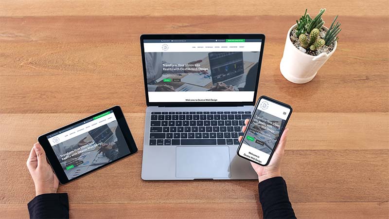
- Mobile-first Approach: Start your design process with mobile users in mind. Given the increasing number of people browsing on smartphones, prioritizing mobile design ensures that your website is user-friendly on smaller screens. This approach often results in a cleaner, more efficient design that scales well to larger screens. Deaton Web Design prioritizes a mobile-first approach, ensuring seamless adaptation to various devices for an optimal viewing experience.
- Fluid Grids and Flexible Layouts: Use fluid grids that allow elements to resize proportionally rather than using fixed-width layouts. This flexibility ensures that your content looks good on any device. CSS media queries can help apply different styles based on the screen size, orientation, and resolution.
- Responsive Images: Optimize images to load quickly and display correctly on various devices. Use HTML5’s
srcsetattribute to specify different image sizes for different resolutions, ensuring that users always see the best quality image without unnecessary load times. - Touch-Friendly Navigation: Design navigation elements to be easily accessible on touchscreens. This includes using larger buttons, ensuring enough spacing between clickable items, and avoiding hover-dependent interactions that don’t work well on mobile devices.
- Testing Tools: Utilize tools like Google’s Mobile-Friendly Test and responsive design testing tools to check how your website performs across different devices. Regular testing helps identify and fix any issues, ensuring a consistent user experience.
- Performance Optimization: Mobile users often have slower internet connections, so optimizing your website’s performance is essential. Minimize the use of heavy scripts, leverage browser caching, and compress files to improve load times. Faster websites not only enhance user experience but also contribute to better search engine rankings.
By implementing responsive design principles, you ensure that your website provides a seamless and enjoyable experience for all users, regardless of the device they use. This adaptability can significantly increase user engagement and satisfaction, driving more conversions and ultimately contributing to your business growth.
Visual Hierarchy
Visual hierarchy is a critical design principle that organizes content in a way that naturally guides the user’s eye through the information on your website. By strategically arranging elements, you can direct attention to the most important parts of your site, enhancing user engagement and making the overall experience more intuitive. Here are key strategies to establish a strong visual hierarchy:
- Contrast: Utilize color contrast to highlight key elements and make them stand out. For instance, use a bold color for your call-to-action buttons or important headings to draw immediate attention. High contrast between text and background colors also improves readability.
- Size and Scale: Make important elements larger to signify their importance. Larger text or images attract more attention, so use size variations to create a visual flow. Headlines should be bigger than subheadings, which in turn should be bigger than body text.
- Typography: Choose fonts that are easy to read and align with your brand’s identity. Use different font weights and styles to create a hierarchy within your text. For example, bold fonts can be used for headlines, while regular fonts are used for body text. Consistent use of typography styles helps users quickly distinguish between different types of information.
- Whitespace: Don’t underestimate the power of whitespace (or negative space). Proper use of whitespace can make your content more readable and visually appealing. It helps separate different sections and prevents your design from feeling cluttered, making it easier for users to focus on individual elements.
- Alignment and Layout: Align elements in a structured way to create a clean and organized look. Consistent alignment helps users navigate your site more intuitively. Grid-based layouts can provide a solid framework for organizing content systematically.
- Imagery and Icons: Use relevant images and icons to support your content and guide users. Visual elements can break up text and make your site more engaging. However, ensure that all visuals are high quality and contribute to the overall message rather than distracting from it.
- Directional Cues: Use directional cues like arrows or lines to guide users towards important sections or calls to action. These subtle hints can effectively steer users through your website’s content.
By carefully considering and implementing these aspects of visual hierarchy, you can create a website that is not only visually appealing but also easy to navigate. This leads to a better user experience, higher engagement rates, and ultimately, more conversions for your business.
User Experience (UX) Enhancements
Enhancing the user experience (UX) on your website is essential for retaining visitors and converting them into customers. A positive UX ensures that users find your website intuitive, enjoyable, and easy to navigate. Here are several strategies to improve the UX of your site:
- Navigation: Ensure that your site navigation is intuitive and logical. Use clear, descriptive labels for menu items and organize them in a way that makes sense to users. Implement a search function to help users find specific content quickly. Breadcrumbs can also help users understand their location within your site and navigate back to previous pages easily.
- Load Times: Optimize your website’s performance to ensure fast load times. Compress images, leverage browser caching, and minimize the use of heavy scripts. A faster website not only improves user satisfaction but also positively impacts your search engine rankings.
- Consistent Design: Maintain a consistent design throughout your website to provide a cohesive experience. Use a unified color scheme, typography, and design elements across all pages. Consistency helps users become familiar with your site, making it easier for them to navigate and find information.
- Accessible Design: Make your website accessible to all users, including those with disabilities. Use alt text for images, ensure sufficient color contrast, and make your site navigable via keyboard. Accessibility improves the overall UX and broadens your audience reach.
- Interactive Elements: Incorporate interactive elements like hover effects, animations, and micro-interactions to engage users. However, use these elements sparingly to avoid overwhelming users and ensure they enhance rather than detract from the UX.
- Feedback Mechanisms: Implement mechanisms to gather user feedback, such as surveys, feedback forms, and comment sections. Understanding user feedback helps identify pain points and areas for improvement. Act on this feedback to continuously refine the user experience.
- Content Readability: Ensure that your content is easy to read and understand. Use short paragraphs, bullet points, and headings to break up text. Choose a legible font size and style, and ensure that there is adequate spacing between lines and paragraphs.
- Call to Action (CTA) Optimization: Design your CTAs to be clear and compelling. Use action-oriented language and make sure CTAs are prominent and easy to find. Effective CTAs guide users toward desired actions, such as making a purchase or signing up for a newsletter.
- A/B Testing: Continuously test different design elements and layouts to see what works best for your audience. A/B testing allows you to compare variations of a webpage and determine which one provides a better user experience and higher conversion rates.

By focusing on these UX enhancements, you can create a website that not only meets user expectations but also exceeds them. A well-designed user experience encourages visitors to stay longer, explore more, and take desired actions, ultimately driving business growth and success.
SEO and Web Design
Optimizing your website for search engines is crucial for increasing visibility and attracting more visitors. Good SEO practices should be integrated into your web design from the ground up to ensure that your site is easily discoverable by search engines and provides a positive user experience. Here are key strategies to achieve this:
- Semantic HTML: Use HTML5 elements to structure your content logically. Tags like
<header>,<nav>,<article>,<section>, and<footer>help search engines understand the hierarchy and importance of content on your pages. This semantic approach improves your site’s SEO and makes it more accessible. - Keyword Research and Optimization: Conduct thorough keyword research to identify the terms and phrases your target audience is searching for. Integrate these keywords naturally into your content, including titles, headings, meta descriptions, and body text. Avoid keyword stuffing, as it can negatively impact your rankings.
- Meta Tags: Optimize meta tags, including title tags and meta descriptions, to accurately describe your content and include relevant keywords. These tags are crucial for search engine results pages (SERPs) and influence click-through rates.
- URL Structure: Create clean, descriptive URLs that include relevant keywords. Avoid using long, complex URLs with unnecessary parameters. A clear URL structure helps both users and search engines understand the content of your pages.
- Internal Linking: Use internal links to connect related content within your website. This helps search engines crawl your site more effectively and improves user navigation. Ensure that anchor text is descriptive and relevant to the linked content.
- Mobile Optimization: Ensure your website is mobile-friendly, as search engines prioritize mobile-first indexing. A responsive design, as discussed earlier, is essential for providing a good user experience on all devices and improving your search engine rankings.
- Page Load Speed: Optimize your website’s load speed, as slow-loading pages can negatively impact your SEO. Use techniques like image compression, minifying CSS and JavaScript files, and leveraging browser caching to improve performance.
- Quality Content: Focus on creating high-quality, valuable content that addresses the needs and interests of your audience. Regularly update your content to keep it fresh and relevant. High-quality content is more likely to be shared and linked to, which boosts your SEO.
- Alt Text for Images: Use descriptive alt text for images to improve accessibility and help search engines understand the content of your images. Including relevant keywords in alt text can also enhance your SEO.
- Schema Markup: Implement schema markup to provide search engines with additional information about your content. Schema markup can improve the way your pages are displayed in SERPs and enhance your chances of appearing in rich snippets.
- Backlink Strategy: Develop a strategy to earn high-quality backlinks from reputable websites. Backlinks are a significant factor in search engine rankings and can greatly enhance your site’s authority and visibility.

By integrating these SEO strategies into your web design, you can create a site that not only looks good and performs well but also ranks highly in search engine results. This holistic approach ensures that your website attracts more organic traffic, leading to increased visibility, engagement, and conversions. For a detailed checklist on optimizing your site for search engines, read our SEO Checklist for Small Businesses
Call to Action (CTA)
A strong Call to Action (CTA) is crucial for converting visitors into customers. CTAs guide users towards desired actions, such as making a purchase, signing up for a newsletter, or contacting your business. Here are key strategies to create effective CTAs:
- Visibility: Ensure that your CTAs are prominent and easy to find. Place them in strategic locations where users are most likely to take action, such as at the end of blog posts, on landing pages, and within the website header or footer. Use contrasting colors to make CTAs stand out from the rest of the content.
- Clear and Compelling Text: Use clear, concise, and action-oriented language in your CTAs. Phrases like “Get Started,” “Sign Up Now,” “Learn More,” or “Buy Now” are direct and encourage immediate action. Avoid vague language that doesn’t clearly indicate what the user should do next.
- Value Proposition: Highlight the benefits of taking action. Explain what users will gain by clicking on your CTA, whether it’s access to exclusive content, a special discount, or a free trial. Emphasize the value to make your offer more appealing.
- Urgency and Scarcity: Create a sense of urgency or scarcity to encourage users to act quickly. Phrases like “Limited Time Offer,” “Only a Few Spots Left,” or “Expires Soon” can motivate users to take immediate action rather than delaying.
- Design and Placement: Design your CTAs to be visually appealing and aligned with your brand’s style. Use buttons rather than text links, as buttons are more noticeable and inviting to click. Experiment with different shapes, sizes, and colors to see what works best for your audience. Placement is also key—consider placing CTAs above the fold, at the end of relevant content, or in the sidebar for maximum visibility.
- Consistency: Maintain consistency in your CTAs across your website. Use similar design elements and language to create a cohesive experience. Consistency helps users recognize and understand CTAs quickly, increasing the likelihood of action.
- Multiple CTAs: Offer multiple CTAs to cater to different stages of the user journey. For example, a first-time visitor might see a CTA to learn more about your services, while a returning visitor might see a CTA to sign up for a free trial. Tailoring CTAs to different user needs can improve conversion rates.
- Testing and Optimization: Regularly test and optimize your CTAs to ensure they are as effective as possible. Use A/B testing to compare different versions of CTAs and determine which ones perform best. Monitor metrics such as click-through rates and conversion rates to understand the impact of your changes.
By crafting clear, compelling, and strategically placed CTAs, you can guide your visitors toward taking meaningful actions that drive business growth. Effective CTAs are an integral part of your website’s overall design and user experience, contributing significantly to your conversion rates and success.
Regular Updates and Feedback
Maintaining an updated and dynamic website is essential for sustaining user interest and adapting to changing business needs. Regular updates and incorporating user feedback can significantly enhance your website’s performance and relevance. Here are strategies to keep your website fresh and user-centric:
- Content Updates: Regularly update your content to keep it relevant and engaging. This includes blog posts, product descriptions, news articles, and other forms of content. Fresh content not only attracts repeat visitors but also improves your SEO, as search engines favor websites that are frequently updated.
- Design Refresh: Periodically review and update your website’s design to ensure it remains modern and aligned with current trends. This doesn’t necessarily mean a complete redesign, but small updates like changing images, updating the color scheme, or tweaking the layout can keep your site looking fresh.
- User Feedback: Implement mechanisms to gather feedback from your users. This can include surveys, feedback forms, or usability tests. Pay attention to the feedback you receive and use it to make informed decisions about design and content changes. Users appreciate knowing their opinions are valued, which can enhance their loyalty.
- Analytics Monitoring: Use analytics tools to monitor user behavior on your website. Track metrics such as page views, bounce rates, time on site, and conversion rates. Analyzing this data helps identify which areas of your website are performing well and which need improvement.
- Security Updates: Ensure that your website’s software, plugins, and security features are regularly updated to protect against vulnerabilities. Keeping your site secure is crucial for maintaining user trust and preventing data breaches.
- Performance Optimization: Regularly assess your website’s performance and make necessary optimizations. This includes optimizing images, minifying code, and leveraging caching to ensure fast load times. A well-performing website enhances user experience and can improve your search engine rankings.
- Seasonal and Event Updates: Take advantage of seasonal events, holidays, and special occasions by updating your website’s content and design accordingly. This can include themed promotions, special offers, or relevant blog posts. These updates keep your site timely and engaging.
- Interactive Features: Introduce or update interactive features to enhance user engagement. This could include live chat support, interactive forms, or social media integrations. Interactive elements can improve user experience and provide more opportunities for engagement.
- Test and Iterate: Continuously test different aspects of your website to identify what works best. A/B testing can be particularly useful for comparing different versions of pages, content, or CTAs. Use the insights gained from testing to make iterative improvements.
By regularly updating your website and actively seeking and incorporating user feedback, you can create a dynamic and responsive online presence. This proactive approach helps keep your website relevant, engaging, and aligned with your business goals, ultimately driving sustained growth and success.
Conclusion
Web design is not just about creating a visually appealing online presence; it’s a strategic tool that can significantly impact your business growth. By focusing on key elements such as understanding your audience, implementing responsive design, establishing a strong visual hierarchy, enhancing user experience, optimizing for search engines, crafting effective calls to action, and maintaining regular updates, you can create a website that not only attracts visitors but also converts them into loyal customers.
Each strategy plays a vital role in ensuring your website performs at its best. Understanding your audience allows you to tailor your content and design to meet their needs, while responsive design ensures accessibility across all devices. A well-structured visual hierarchy guides users through your content, and enhanced user experience keeps them engaged and satisfied. SEO optimization increases your site’s visibility, and strong CTAs drive user actions that lead to conversions. Regular updates and user feedback help you stay relevant and continuously improve.
In the rapidly evolving digital landscape, staying ahead requires a combination of innovative design and strategic thinking. By leveraging these key web design strategies, you can create a powerful online platform that supports your business objectives and drives sustained growth. Remember, your website is often the first point of contact with potential customers—make it count.