A user-friendly navigation menu is crucial for the success of any website. It serves as the primary guide for visitors, helping them find information quickly and efficiently. An intuitive navigation menu enhances the user experience, encourages longer site visits, and can significantly impact conversion rates. As web design continues to evolve, so do the best practices for creating effective navigation menus. This article will explore key aspects of designing a user-friendly navigation menu, from simplicity and organization to responsiveness and accessibility. By understanding and implementing these practices, you can create a navigation menu that meets the needs of your audience and improves the overall performance of your website.
Simplicity and Clarity
Creating a simple and clear navigation menu is the foundation of a user-friendly website. Visitors should be able to understand the menu structure at a glance, without any confusion or difficulty. A streamlined and straightforward navigation menu not only improves the user experience but also enhances the overall aesthetic of the website.
- Minimalist Design: A clutter-free navigation menu with only the most essential links prevents overwhelming the user. Fewer items mean easier decision-making and a more streamlined user experience.
- Minimalism in navigation design reduces cognitive load, allowing users to focus on key content. When users are not bombarded with too many options, they can navigate more efficiently and find what they need without distraction.
- A clean layout with ample white space improves readability and aesthetic appeal. White space helps to separate elements on the page, making it easier for users to process information and navigate through the menu.
- Avoiding excessive dropdowns and nested menus helps maintain simplicity. Dropdowns and nested menus can complicate navigation and may not be intuitive for all users. Keeping the menu simple ensures that users of all skill levels can navigate the site with ease.
- Descriptive Labels: Use clear, concise labels that accurately describe the content of each section. Avoid jargon and ensure the language is easily understood by your target audience.
- Descriptive labels guide users directly to the information they seek, reducing frustration. When labels are clear and intuitive, users can quickly find the content they are looking for without having to guess or backtrack.
- Consistent terminology across the site reinforces brand messaging and aids in navigation. Using the same terms throughout the site creates a cohesive experience and helps users learn the navigation structure more quickly.
- Testing labels with real users can provide valuable insights into their effectiveness. User testing can reveal whether the labels are understandable and if any changes are needed to improve clarity and usability.
Summarizing, simplicity and clarity in navigation design enhance the overall user experience. By focusing on minimalism and using descriptive labels, you create a straightforward and engaging path for visitors to follow. This approach not only helps users find what they need but also contributes to a more professional and polished website appearance.
Organization and Hierarchy
Effective organization and hierarchy in a navigation menu help users understand the structure of your website. A logical arrangement of links ensures that visitors can easily find the information they need. Proper organization and hierarchy make the navigation intuitive and user-friendly, encouraging users to explore more pages on your site.
- Categorization: Group related items together to create a logical flow. Use categories that make sense to your audience and reflect the website’s content structure.
- Categorization simplifies the navigation process by presenting information in manageable chunks. When content is grouped logically, users can scan through categories and find relevant information without feeling overwhelmed.
- It helps users understand the relationship between different sections of the site. Clear categories show how different pages and content areas are related, which can improve the user’s understanding of the site’s structure.
- Visual cues, like headings or separators, can enhance category distinction. Headings and separators can help break up the menu into distinct sections, making it easier for users to navigate through different categories.
- Prioritization: Place the most important and frequently visited links at the top of the menu. This ensures that key pages are easily accessible and reduces the time users spend searching for them.
- Prioritizing important links improves user satisfaction and engagement. When users can quickly access the most relevant pages, they are more likely to stay on the site and explore further.

- High-priority items should be positioned prominently, such as in the header or main menu. Placing essential links in prominent positions makes them more visible and accessible to users.
- Analyzing user behavior through analytics can help determine which links are most critical. By examining which pages users visit most often, you can prioritize those links in the navigation menu to meet user needs better.
To conclude, organizing your navigation menu with clear categorization and prioritization helps users navigate your site effortlessly. A well-structured menu enhances usability and ensures that critical information is always within reach. This thoughtful organization not only improves the user experience but also supports your website’s goals by guiding users to important content and actions.
Responsiveness and Mobile Friendliness
With the increasing use of mobile devices, ensuring your navigation menu is responsive and mobile-friendly is essential. A responsive design adapts to different screen sizes, providing a seamless experience across devices. As more users access websites from smartphones and tablets, mobile-friendly navigation becomes a critical component of modern web design.
- Responsive Design: Implement a flexible layout that adjusts to various screen sizes, from desktops to smartphones. This includes scalable fonts, touch-friendly buttons, and adaptive menu styles.
- Responsive design enhances accessibility, making your site usable on any device. Users can access your site from their preferred device without encountering usability issues, improving their overall experience.
- It improves load times and performance, which are crucial for mobile users. Fast-loading pages are essential for keeping mobile users engaged and preventing them from leaving due to slow performance.
- Tools like CSS media queries and frameworks like Bootstrap can aid in creating responsive designs. These tools provide the necessary functionality to build a responsive layout that adapts seamlessly to different screen sizes.
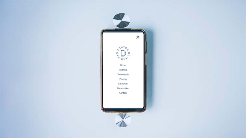
- Mobile Navigation: Optimize the navigation experience for mobile users by using techniques like collapsible menus, hamburger icons, and swipe gestures.
- Mobile-specific navigation features enhance usability on smaller screens. Features like collapsible menus and hamburger icons save space and provide a cleaner interface for mobile users.
- Simplifying the menu for mobile devices reduces clutter and improves user interaction. A simplified menu ensures that users can easily find and access the most important links without excessive scrolling or tapping.

- Testing the mobile navigation with real users ensures that it meets their needs and expectations. User testing can reveal potential issues with the mobile navigation and provide insights into how it can be improved.
In summary, ensuring that your navigation menu is responsive and mobile-friendly is vital in today’s digital landscape. By adapting to different devices and optimizing for mobile, you provide a consistent and enjoyable user experience for all visitors. This approach not only improves usability but also helps retain mobile users, who represent a significant portion of web traffic.
Accessibility and Usability
Creating an accessible and usable navigation menu ensures that all users, including those with disabilities, can navigate your site effectively. Accessibility is not only a legal requirement but also a moral obligation. Ensuring that your site is accessible demonstrates a commitment to inclusivity and can enhance your brand’s reputation.
- Keyboard Navigation: Ensure that all navigation elements can be accessed and operated using a keyboard. This is essential for users with motor disabilities who cannot use a mouse.
- Keyboard-friendly navigation includes proper tab order and focus indicators. Ensuring that users can navigate through the menu using the tab key and see which element is focused helps improve accessibility.
- Providing shortcuts for common actions can enhance the experience for keyboard users. Keyboard shortcuts can make navigation more efficient and user-friendly for those who rely on keyboard input.
- Testing with assistive technologies like screen readers helps identify and fix accessibility issues. Conducting tests with screen readers and other assistive tools ensures that your site meets the needs of all users.
- ARIA Landmarks: Use ARIA (Accessible Rich Internet Applications) landmarks to define different sections of your navigation menu. This helps screen readers interpret and navigate the site more effectively.
- ARIA landmarks improve the accessibility of complex web applications. By providing clear roles and properties, ARIA landmarks help assistive technologies understand the structure and function of different elements.
- They provide meaningful context to assistive technologies, aiding navigation. Landmarks like “navigation” and “main” give screen readers and other tools the information they need to guide users through the site.
- Implementing ARIA roles, properties, and states ensures a more inclusive user experience. Using ARIA attributes to enhance the accessibility of your site can make a significant difference for users with disabilities.
In conclusion, prioritizing accessibility and usability in your navigation menu design ensures that your website is inclusive and user-friendly. By focusing on keyboard navigation and ARIA landmarks, you create a site that everyone can use with ease. This commitment to accessibility not only meets legal standards but also fosters a positive and inclusive user experience for all visitors.
Creating a user-friendly navigation menu is a critical aspect of web design that can significantly impact the success of your website. By focusing on simplicity and clarity, organization and hierarchy, responsiveness and mobile friendliness, and accessibility and usability, you can design a navigation menu that enhances the user experience and meets the needs of all visitors. As web design trends continue to evolve, staying updated with best practices and continuously testing your navigation menu will ensure that your site remains effective and engaging. Implementing these strategies not only improves usability but also supports your website’s goals by guiding users to important content and actions.
