
A website’s success often hinges on its ability to convert visitors into customers. Central to this conversion process is the Call-to-Action (CTA), a crucial element that guides users towards taking desired actions such as making a purchase, subscribing to a newsletter, or filling out a contact form. Effective CTAs can significantly enhance user engagement, improve conversion rates, and ultimately drive business growth. However, crafting compelling CTAs requires more than just placing a button on a page; it involves strategic placement, persuasive language, and an understanding of user psychology. This article explores effective CTA strategies to help you optimize your website for better performance and increased conversions.
The Power of Persuasive Language
The language you use in your CTAs can make a significant difference in how users respond. Persuasive language taps into the emotions and motivations of your audience, encouraging them to take action.
- Use Action-Oriented Verbs: Start your CTAs with strong, action-oriented verbs that clearly communicate the desired action. For example, instead of saying “Learn More,” opt for “Discover Our Features” to create a sense of adventure and curiosity.
- Action verbs create a sense of urgency and direction, making it clear what the user should do next. They serve as a prompt, pushing users towards immediate engagement rather than passive consideration.
- They also help in making the CTA more engaging and less passive, prompting immediate response. By invoking a sense of action, users feel more compelled to interact with your CTA.
- Examples include “Get Started,” “Join Now,” “Shop Today,” which all provide clear instructions and motivate users to act promptly. These phrases not only convey urgency but also promise a direct benefit or outcome from the action.

- Incorporate Benefits: Highlight the benefits users will gain by taking the desired action. Instead of a generic “Sign Up,” try “Sign Up for Exclusive Deals” to emphasize the value they will receive.
- Focusing on benefits helps users see the immediate value in their actions, increasing the likelihood of conversion. It aligns their actions with their personal goals or desires, making the CTA more relevant and appealing.
- It also creates a positive expectation, making the action seem more rewarding. When users understand what they stand to gain, they are more inclined to take the desired step.
- This approach can significantly enhance the appeal of your CTA, making it more compelling and effective. By clearly articulating the benefits, you build trust and entice users to engage more readily.
Summarizing the power of persuasive language, remember that the right words can transform a simple button into a powerful motivator. By using action-oriented verbs and emphasizing benefits, you can create CTAs that not only attract attention but also drive meaningful engagement.
Strategic Placement of CTAs
Where you place your CTAs on your website is just as important as the wording. Strategic placement ensures that users encounter CTAs at the right moments in their journey.
- Above the Fold: Place crucial CTAs above the fold, where they are visible without scrolling. This ensures that visitors see the CTA immediately upon landing on the page.
- Above-the-fold placement captures the attention of users right away, increasing the chances of immediate engagement. Users are more likely to interact with CTAs that they can see without having to scroll.
- It is particularly effective for primary actions you want users to take without requiring them to scroll down. This can lead to higher conversion rates as users can quickly act on the CTA without additional effort.
- This placement works well for important actions like signing up for a newsletter or starting a free trial. By placing CTAs here, you ensure maximum visibility and potential interaction from visitors.
- Within Content: Embed CTAs within your content, such as in the middle of a blog post or after a compelling story. This approach makes the CTA feel more natural and relevant.
- In-content CTAs can appear less intrusive, blending seamlessly with the surrounding content. They integrate naturally into the user’s reading experience, making them more likely to engage.
- They are effective because they appear at moments when users are already engaged with the content, making them more receptive to taking action. This strategic placement leverages the user’s current interest and attention.
- This strategy works well for secondary actions, such as downloading an ebook or watching a video. It provides an additional touchpoint for engagement without disrupting the user’s experience.
Strategic placement is key to maximizing the effectiveness of your CTAs. By positioning them above the fold and within engaging content, you can ensure they catch users’ attention and prompt timely actions.
Designing Eye-Catching CTAs
Design plays a crucial role in making your CTAs stand out. An eye-catching design can draw users’ attention and encourage them to click.
- Contrast and Colors: Use contrasting colors to make your CTAs stand out from the rest of the page. Choose colors that are not only visually appealing but also aligned with your brand identity.
- High contrast ensures that CTAs are easily noticeable, even at a glance. The human eye is naturally drawn to areas of high contrast, making these CTAs more prominent.
- Color psychology can also play a role; for example, red can create a sense of urgency, while green is often associated with positive actions. Understanding the emotional impact of colors can enhance the effectiveness of your CTAs.
- Ensure the colors fit well with your overall design to maintain a cohesive look and feel. Consistency with your brand identity helps build trust and recognition among your audience.

- Size and Shape: Ensure your CTAs are appropriately sized—large enough to be noticeable but not so large that they overwhelm the page. Rounded edges can often appear more inviting.
- The size should strike a balance between visibility and aesthetics, ensuring it grabs attention without disrupting the overall design. A well-sized CTA is easily clickable and stands out without dominating the page.
- Rounded edges and ample padding can make the CTA button feel more clickable and user-friendly. These design elements contribute to a more pleasant user experience, encouraging interaction.
- Testing different shapes and sizes can help you find the most effective design for your audience. User preferences can vary, so experimenting with different designs can provide valuable insights.
An effective CTA design combines visual appeal with functional clarity. By using contrasting colors and appropriately sizing your CTAs, you can create buttons that not only catch the eye but also encourage action.
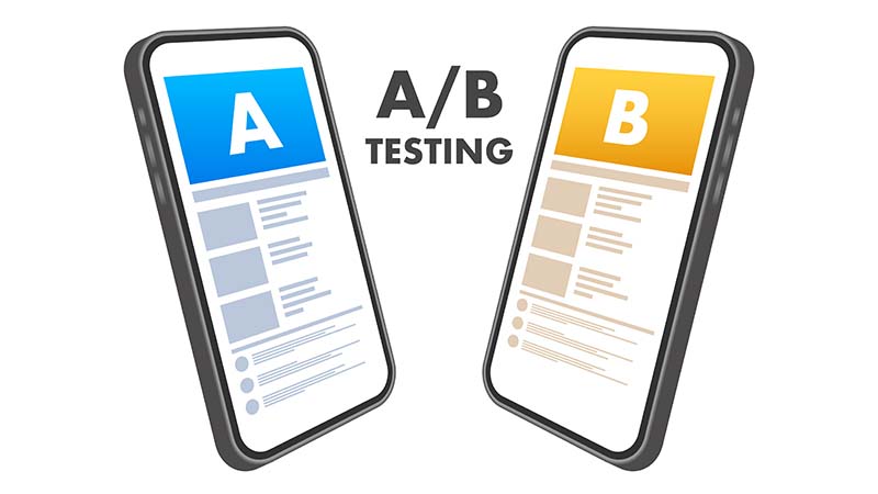
A/B Testing for Continuous Improvement
A/B testing is a powerful method to refine your CTAs and ensure they are as effective as possible. By comparing different versions, you can determine what works best for your audience.
- Test Different Texts: Experiment with different wording to see which resonates more with your audience. For example, compare “Get Your Free Trial” with “Start Your Free Trial Now.”
- Small changes in wording can lead to significant differences in user response. The way you phrase your CTA can impact its perceived value and urgency.
- Testing multiple versions helps identify the most persuasive and effective language. Data-driven insights from A/B testing can guide you in choosing the optimal wording.
- Continuously iterating based on results ensures your CTAs remain optimized. Regular testing and refinement help you adapt to changing user preferences and behaviors.
- Experiment with Placement: Try placing your CTAs in various locations on your website to see where they perform best. For instance, compare the effectiveness of a CTA above the fold versus one at the end of an article.
- Different placements can have varying impacts on user engagement and conversion rates. Understanding where your audience is most likely to engage with CTAs can inform your placement strategy.
- Testing placement helps determine the most strategic locations for maximizing visibility and action. By identifying high-performing locations, you can optimize the layout of your website.
- Regularly revisiting and adjusting placements based on user behavior ensures ongoing effectiveness. As user habits evolve, so should your CTA placement strategy to maintain high engagement.
A/B testing allows for data-driven decisions, helping you optimize your CTAs for maximum impact. By continually testing different texts and placements, you can refine your strategy and enhance your website’s performance.
Effective call-to-action strategies are essential for converting website visitors into engaged customers. By focusing on persuasive language, strategic placement, eye-catching design, and continuous improvement through A/B testing, you can significantly enhance the impact of your CTAs. These strategies not only improve user engagement but also drive higher conversion rates, contributing to the overall success of your website. As you implement and refine these techniques, you’ll find that even small adjustments can lead to substantial improvements in user interaction and business growth. Embrace these strategies to create compelling CTAs that guide your visitors towards taking meaningful actions on your website.